
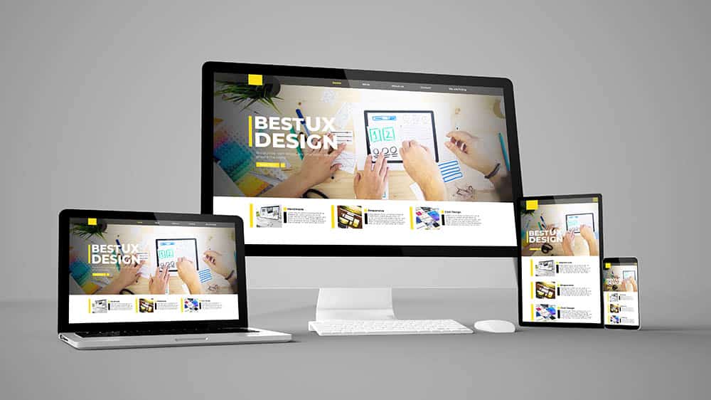
Ensuring your website works seamlessly across all devices is more important than ever. With more people browsing the internet on mobile phones, tablets, and desktops, businesses need a flexible and responsive design. At Salterra, we specialize in responsive web design. Our websites are visually appealing and function flawlessly on every screen.
What is Responsive Web Design and Why is It Important?
Responsive web design refers to an approach where a website is designed to adjust and render well on any device or screen size, whether a smartphone, tablet, or desktop. By using flexible layouts, images, and media queries, a responsive website adapts its elements to fit the device it’s viewed on, ensuring users get an optimized browsing experience. This design principle has become indispensable since more users access mobile and tablet websites.
Responsive Web Design Optimizes Your Website for All Devices
One of the most significant advantages of responsive web design is that it ensures your website looks and performs well across all devices. When people access websites from various devices, you must provide a consistent experience to keep visitors engaged. Without responsive design, users might face distorted images, difficult navigation, or incomplete content, leading to higher bounce rates and fewer conversions.
The Rise of Mobile Usage and the Need for Responsive Design
Worldwide, mobile usage has skyrocketed over the years, including in Tucson, AZ. Recent studies show that over half of all global website traffic comes from mobile devices. This shift has made it essential for businesses to adopt a mobile-first mindset when designing their websites. Suppose your website isn’t optimized for mobile devices. In that case, you risk losing a significant portion of your audience, which can negatively impact your traffic and potential leads.
Improves User Experience
A positive user experience (UX) is vital for retaining visitors and converting them into customers. Responsive web design improves UX by providing a seamless experience regardless of the device used. A site that is easy to navigate, loads quickly, and has consistent visuals makes visitors more likely to stay longer and engage with the content. A responsive site also eliminates the frustration that often comes with trying to navigate non-responsive websites on a mobile device. By working with a professional company specializing in top-tier website creation services, you can ensure a seamless user experience without any worries.
Boost Search Engine Rankings with a Responsive Website
Search engines, especially Google, prioritize websites that offer a great user experience. Responsive web design has become a key factor in determining how well a website ranks in search engine results. Google has publicly stated that it prefers responsive sites because they provide a better experience for mobile users. This means a responsive website can help improve your search rankings, leading to more traffic and visibility for your business.
Save Time and Money with Lower Maintenance Costs
In the past, businesses often created separate versions of their websites for desktop and mobile users, leading to higher maintenance costs. Responsive web design eliminates the need for two different site versions. A single, responsive website is easier to manage, more cost-effective, and requires less time to update. This streamlined approach means you can focus more on growing your business and less on maintaining your site.
How Responsive Web Design Enhances Website Performance
Page Load Speed and Its Importance
Page load speed determines a website’s performance and overall success. In today’s fast-paced digital environment, users expect websites to load instantly. Research has shown that even a one-second delay in page load time can lead to significant consequences. According to a study by Google, as page load time increases from one second to ten seconds, the probability of a mobile site visitor bouncing (leaving the site without engaging) increases by 123%. This stark statistic highlights the need for businesses in Tucson, Arizona, to prioritize speed to enhance user satisfaction and engagement.
The Impact of Load Time on User Experience
A fast-loading website leads to a better user experience, vital for retaining visitors and reducing bounce rates. When users encounter slow-loading pages, they often become frustrated and are more likely to abandon the site altogether. This not only affects immediate traffic but can also have long-term implications on brand perception. Users will likely associate slow load times with a lack of professionalism and reliability, potentially damaging your brand’s reputation.
Optimizing Page Speed Through Responsive Web Design
Responsive web design employs several techniques to optimize page speed effectively. Here are some key strategies:
- Image Compression: Images are often the largest files on a webpage, and large, unoptimized images can drastically slow download times. Responsive design prioritizes image compression techniques, which reduce file sizes without compromising quality. Websites can minimize load times and enhance performance by serving appropriately sized images for different devices. Formats like WebP and JPEG 2000 can maintain high-quality visuals while keeping file sizes manageable.
- Browser Caching: Caching allows a website to store frequently accessed data temporarily on the user’s device. This means that when a user returns to the site, the browser can load the saved data instead of retrieving it from the server, significantly speeding up the load time. Responsive web design integrates caching mechanisms to ensure users enjoy faster load times, improving overall performance.
- Minimized Code: Minimizing HTML, CSS, and JavaScript files is another technique to enhance page speed. By reducing unnecessary characters, spaces, and comments, responsive web design ensures that web pages are less bulky, allowing them to load faster. Tools like minifiers can automate this process, ensuring your website’s code remains optimized for performance.
- Responsive Design Techniques: Media queries in responsive design allow for loading specific elements tailored to the user’s device. For example, a website can serve different layouts and images based on the screen size, ensuring that only necessary resources are loaded. This selective loading reduces the amount of data transferred, improving page speed and performance.
- Content Delivery Networks (CDNs): Utilizing CDNs can significantly enhance website performance by distributing content across multiple servers worldwide. This reduces the physical distance between the user and the server, leading to faster load times. Responsive web design can seamlessly integrate with CDNs, ensuring that users receive the content from the closest server.
- Mobile-First Design: A mobile-first approach inherently considers load times. Developers can create leaner versions of web pages that prioritize essential content by designing for smaller screens and gradually scaling up for larger devices. This method optimizes performance and simplifies the user experience, focusing on what matters most to users.
Better Performance Means Better SEO
Website performance, particularly load speed, is significant in search engine optimization (SEO). Search engines like Google consider page speed to be a ranking factor. A faster website enhances user experience and improves visibility on search engine results pages (SERPs). Consequently, a well-optimized responsive website is more likely to attract organic traffic and rank higher, leading to increased visibility and potential conversions.
The User Journey and Retention Rates
Responsive web design enhances the overall user journey by ensuring visitors have a seamless and efficient experience. Fast load times create a positive first impression, encouraging users to explore further rather than bouncing away. Websites that load quickly foster a sense of reliability and professionalism, instilling confidence in potential customers.
Studies have shown that faster websites lead to increased retention rates. Users with positive experiences are more likely to return, share the site with others, and convert into paying customers. Therefore, investing in responsive design not only improves performance but also supports long-term business growth and customer loyalty.
Easier Website Navigation
A well-designed, responsive website offers intuitive navigation, making it easy for visitors to find what they want. The layout adapts to different screen sizes, ensuring menus, buttons, and other navigational elements are easy to access and use. This improved navigation helps keep visitors on your site longer, increases engagement, and enhances the likelihood of conversions.
Responsive Web Design Increases Conversions
One of the primary goals of any website is to convert visitors into customers or leads. Many businesses opt for landing pages because they often enhance conversion rates. Understanding whether to use a full website or a landing page for your business is essential. Regardless of your choice, both can greatly benefit from responsive design principles. Responsiveness of a website plays a key role in achieving this by making it easier for users to interact with your site. Whether they’re filling out a form, making a purchase, or contacting you for more information, a responsive design ensures that visitors have a smooth and enjoyable experience, regardless of their device.
The Future-Proofing Benefits of Responsive Design
Technology and the devices people use to browse the internet are constantly evolving. By adopting a responsive web design strategy, you can future-proof your website, ensuring it remains functional and user-friendly no matter what new devices come to market. This adaptability makes responsive design a smart long-term investment for businesses looking to stay competitive in the digital space.
Comprehensive Responsive Design Checklist
A responsive design enhances user experience, improves search engine rankings, and boosts conversions. To help you create a seamless experience for your visitors, here’s a comprehensive, responsive design checklist to ensure your website performs optimally on all devices.
- Flexible Layouts
- Utilize fluid grids that adapt to different screen sizes.
- Ensure all elements are scalable to fit various resolutions.
- Media Queries
- Implement CSS media queries to apply different styles based on device characteristics (e.g., width, height, orientation).
- Test various breakpoints to determine where design adjustments are necessary.
- Responsive Images
- Use srcset and sizes attributes to deliver appropriately sized images based on the device’s screen size.
- Optimize images using formats like WebP for faster loading without sacrificing quality.
- Viewport Meta Tag
- Include the viewport meta tag in your HTML to control the layout on mobile browsers.
- Ensure the tag is set to width=device-width, initial-scale=1 for proper scaling.
- Navigation Menu
- Design a responsive navigation menu that works on all screen sizes (consider using hamburger menus).
- Ensure the menu is easy to use on touch devices, with adequately sized buttons.
- Touch-Friendly Elements
- Make buttons and interactive elements large enough for users to tap easily on touch screens.
- Maintain sufficient spacing between touchable elements to prevent misclicks.
- Typography
- Use relative units (em or rem) for font sizes to ensure text scales appropriately on different devices.
- Test text readability on various screens, ensuring proper line height and spacing.
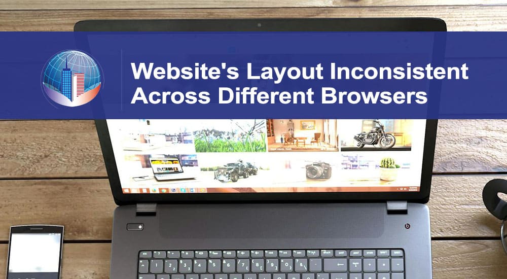
- Test Across Devices and Browsers
- Regularly test your website on multiple devices, including smartphones, tablets, and desktops.
- Check compatibility across browsers (Chrome, Firefox, Safari, Edge) to ensure consistent functionality.
- Performance Optimization
- Minimize HTTP requests by combining files (CSS, JavaScript) where possible.
- Leverage browser caching to improve load times for returning visitors.
- Accessibility Considerations
- Ensure all interactive elements are keyboard navigable for users with disabilities.
- Use ARIA (Accessible Rich Internet Applications) roles and attributes to enhance screen reader compatibility.
- Content Scaling
- Implement CSS techniques like flexbox or grid to ensure content is appropriately spaced and aligned across devices.
- Avoid fixed widths and heights to allow content to adapt fluidly.
- Testing Tools
- Utilize responsive design testing tools (e.g., Google Mobile-Friendly Test, BrowserStack) to assess how your site appears on various devices.
- Regularly monitor site performance using analytics tools to identify areas for improvement.
- Continuous Updates
- Keep your design updated with the latest responsive design trends and best practices.
- Regularly review and test your website to ensure it remains functional and user-friendly across all platforms.
Common Questions on Responsive Web Design
What happens if a website is not responsive?
If a website is not responsive, it can lead to negative consequences that significantly impact user experience and overall site effectiveness. Non-responsive websites do not adapt to different screen sizes, forcing users on mobile devices to zoom in or scroll horizontally to access content. This frustrating experience often results in higher bounce rates, as visitors quickly abandon sites that are difficult to navigate. As more users rely on smartphones and tablets for browsing, a non-responsive design can deter potential visitors, leading to decreased traffic and lost opportunities.
A non-responsive website can also incur higher maintenance costs. Maintaining separate desktop and mobile site versions complicates updates and can increase development time and expenses. Ultimately, a website that fails to provide a seamless browsing experience can harm your brand’s reputation; visitors may view your business as outdated or unprofessional, which could sway their decision to engage with you. The culmination of these factors results in lost conversions, reduced user engagement, and a negative impact on your bottom line.
Do I need to pay more if I want my website to be responsive?
While the initial development costs for a responsive website may be higher than a simple, static site, the long-term savings and benefits often outweigh these expenses. Creating a responsive design typically requires more expertise and time to ensure the site adapts seamlessly across various devices and screen sizes. However, investing in responsive design can lead to significant long-term savings, as a single, responsive site eliminates the need for maintaining separate mobile versions. This reduces maintenance and update costs and streamlines your digital marketing efforts by allowing you to manage one site instead of multiple versions.
A responsive website can enhance user experience, drive more traffic, and increase conversion rates, ultimately improving your return on investment (ROI). Many web design agencies offer responsive design as part of their standard service packages, meaning that the costs may not be significantly higher than for non-responsive sites. While extensive customization or advanced features may increase costs, the overall benefits of a responsive design—such as better usability, improved SEO rankings, and increased customer engagement—make it a worthwhile investment for any business looking to thrive in today’s digital landscape.
Improve Website Performance with Salterra
Responsive web design is essential for businesses aiming to succeed online. It enhances user experience, boosts search rankings, reduces maintenance costs, and improves website performance. As a result, responsive websites are more likely to attract and retain visitors, which can lead to increased conversions and business growth.
At Salterra, we understand the importance of responsive web design in today’s mobile-driven world. Our team is dedicated to building websites that look great and deliver results. If you’re ready to optimize your site for all devices and boost your online presence, contact us today at (520) 214-3729. Let us help you create a website that works for your business 24/7.
Frequently Asked Question and Salterra Website Design.
Why Trust Salterra
Salterra Web Design is a premier Tucson web design agency dedicated to helping local businesses thrive online. Since 2011, we have specialized in creating stunning, user-friendly websites for small—to medium-sized businesses in Tucson, Arizona. Our team of experienced web developers, graphic designers, and digital marketing professionals works together to provide comprehensive digital solutions tailored to your business needs.
At Salterra, we offer a wide range of services designed to enhance your online presence and drive business growth:
- Web Design and Development: We create beautiful, responsive websites that look great and provide a seamless user experience across all devices. Our designs are tailored to reflect your brand identity and meet your business goals.
- Search Engine Optimization (SEO): Our expert SEO services ensure your website is easily found by potential customers. We use advanced techniques to improve your search engine rankings, increase organic traffic, and boost your online visibility.
- Digital Marketing: From social media management to pay-per-click (PPC) advertising, our digital marketing strategies are designed to engage your audience and convert visitors into loyal customers. We focus on creating targeted campaigns that deliver measurable results.
- Content Marketing: Our team produces high-quality, engaging content that resonates with your audience and enhances your brand’s online presence. We help you build authority and trust through valuable and informative content.
- Website Hosting and Maintenance: We provide reliable hosting solutions and ongoing website maintenance to ensure your site remains secure, up-to-date, and performs at its best.
As a family-owned business, we offer personalized service and build long-term client relationships. Our commitment to quality work and fair pricing has earned us a solid reputation in the Tucson community. We understand local businesses’ unique challenges and are passionate about helping them succeed in the digital world.
If you are looking for a trusted partner to elevate your online presence, look no further than Salterra Web Design. Contact us today to learn how we can help your Tucson business grow with our expert web design and digital marketing services.
Contact Information:
Email: info.salterra@gmail.com
Phone: (520) 214-3729
Location: Tucson, AZ
Salterra operates in Arizona, with a strong presence in key regions such as Tucson, Tempe, Phoenix, and Chandler.
Our Locations
Web Design in Casa Adobes | Web Design in Catalina Foothills | Web Design in Marana | Web Design in Oro Valley | Web Design in Drexel Heights
Web Design Sahuarita | Web Design South Tucson | Web Design Green Valley | Web Design Vail


