
Having a mobile-friendly website is not a luxury—it’s a necessity. With mobile devices accounting for more than half of all web traffic globally, businesses cannot overlook the importance of catering to mobile users. A mobile-friendly website does more than just improve your site’s appearance on small screens; it plays a critical role in search visibility, user experience, lead generation, and your company’s online success. This blog post will explore why having a mobile-friendly website is vital and how it can positively affect visitor behavior and your business growth.
At Salterra, we understand the impact of mobile-friendly design. With years of experience in web development, we help businesses build modern, responsive websites that elevate their brand and improve search engine performance.
What is a Mobile-Friendly Website?
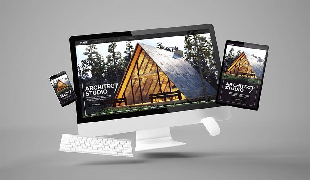
A mobile-friendly website adapts to different screen sizes and provides an optimal experience across devices, whether viewed on a desktop, tablet, or smartphone. These websites are designed to fit smaller screens, load quickly, and provide easy navigation, giving your website visitors a visually appealing, enjoyable encounter with your company. Partnering with a skilled web designer in Tucson, Arizona, ensures that your site is mobile-friendly and tailored to your local audience, driving more engagement and business.
Why Mobile-Friendly Design Matters
Improved Search Visibility
Mobile-friendliness directly impacts your website’s ranking on search engines. Google’s mobile-first indexing means that the mobile version of your website is prioritized in search results. Websites optimized for mobile rank higher and improve their visibility, essential for driving organic traffic. Businesses that neglect mobile optimization risk falling behind competitors and losing out on potential customers.
- Mobile-first indexing boosts your site’s presence in search engines.
- Enhanced search rankings lead to increased visibility and more traffic.
Enhanced User Experience
A mobile-friendly website ensures that visitors have a smooth browsing experience. User experience is crucial because a well-designed mobile site keeps users engaged, prevents frustration, and lowers bounce rates. Users will likely leave if your site doesn’t load properly on mobile devices, costing you leads and conversions.
- A mobile-friendly website enhances user experience by offering clear, easy-to-navigate pages.
- It helps reduce bounce rates by making browsing enjoyable, resulting in longer engagement on your site.
Positive Impact on Visitor Behavior
Mobile-friendly websites positively affect visitor behavior, making users more likely to stay on your site longer and explore more pages. This ultimately increases the chances of conversions, whether you’re seeking sales, sign-ups, or inquiries. When visitors find your website easy to navigate on their phones, they are more inclined to engage with your content and take the desired action.
- Positive user behavior leads to increased conversions and more time spent on-site.
- A clean, mobile-friendly interface encourages users to share your content on social media platforms, boosting the “shareability” factor.
Improved Lead Generation
A mobile-friendly website helps businesses generate more leads by creating an enjoyable user experience that guides visitors to take action. Whether filling out a form, signing up for a newsletter, or purchasing your mobile site should be optimized to make the conversion process as smooth as possible.
- Simplified navigation and quick-loading mobile pages can help improve lead generation.
- A responsive design increases the likelihood of users completing calls to action.
Establish Your Brand as Modern and Technologically Savvy
A mobile-friendly website can help establish your brand as modern, technologically savvy, and responsive to consumer needs. In an era where people expect instant access to information, having a website that adapts effortlessly to all devices can enhance your brand’s credibility and appeal. Businesses that fail to adopt mobile optimization may be seen as outdated or unresponsive to market trends.
- A modern, mobile-optimized website builds trust and reflects your brand’s ability to adapt to technological changes.
- Establishing a strong, up-to-date online presence is essential for staying competitive.
Faster Loading Speed
Mobile-optimized websites are designed to load quickly, essential for keeping visitors engaged. Studies show that users expect pages to load within seconds, and delays can result in higher bounce rates. By optimizing your site for mobile, you can ensure a faster, smoother experience for your users.
- Websites designed for mobile load faster, improving the user experience and reducing bounce rates.
- Faster loading speed is a significant factor in boosting search rankings and improving conversion rates.

Better Accessibility Across Devices
A mobile-friendly website ensures users can easily access your content regardless of their device. This level of accessibility expands your audience’s reach, as it accommodates mobile phones, tablets, and other small-screen devices.
- Mobile-friendly websites are accessible to a wider audience and ensure users can interact with your business from any device.
- Greater accessibility means more potential customers and broader market coverage.
Increasing Mobile Usage
Mobile usage is growing yearly, with more people using smartphones to search, shop, and browse the web. This increasing trend highlights the importance of catering to mobile users. By making your website mobile-friendly, you are accommodating a large portion of your potential audience and staying relevant in an increasingly mobile-centric world.
- Mobile traffic now surpasses desktop traffic, making mobile optimization essential.
- Businesses that adapt to mobile usage trends are better positioned for future success.
Lower Maintenance Costs
A mobile-friendly website eliminates the need for separate desktop and mobile versions, offering lower maintenance costs. Rather than managing two different versions of your website, responsive design ensures one website works efficiently across all devices. This saves time and resources and provides a consistent user experience.
- With responsive design, you only need one website for all devices.
- Lower maintenance costs free up resources for other areas of business growth.
Easy to Update and Scale
Responsive websites allow you to make changes easily whenever needed, ensuring your site stays current without significant development work. As your business grows, your mobile-friendly website can easily adapt and scale, allowing you to introduce new features or content without major overhauls.
- Mobile-friendly sites are adaptable and can easily be scaled to accommodate business growth.
- Easy updates ensure your website stays fresh and functional.
Checklist on the Importance of Mobile-Friendly Website
- User experience
- Search engine optimization
- Competitive advantage
- Google ranking
- Boosted conversions
- Improved mobile SEO
- Brand identity
- Cost-effectiveness
- Faster load times
- High demand mobile website
- Visibility
- Adaptation to mobile trends
- Build trust
- Increased traffic
- Most people are using mobile
- Accessibility
- Customer retention
- Improve website speed
- Increased engagement
- Low bounce rate
- Mobile-friendly websites are affordable to maintain
- Brand loyalty
- Effective lead generation
- Effective navigation
Common Questions About Mobile Friendly Websites
How do I know if a Mobile Site Can Help My Business?
A mobile site can significantly benefit your business, especially in today’s digital landscape, where mobile usage is steadily increasing. The first indicator that a mobile-friendly website can help your business is your audience’s browsing behavior. A mobile-optimized site becomes essential if customers frequently visit your website through smartphones or tablets. You can see the percentage of visitors using mobile devices by checking your website analytics. Suppose a large portion of your audience is on mobile. In that case, optimizing your site for mobile ensures a better user experience, which leads to higher engagement, conversions, and customer retention.
Additionally, mobile-friendly websites improve your search engine rankings. Google prioritizes mobile-optimized sites, so having a responsive design can help your business appear higher in search results, thus improving visibility and attracting more traffic. Businesses across B2B or B2C industries can benefit from mobile-friendly websites, as visitors can easily navigate, read, and interact with your content, leading to more leads and sales.
Does a Mobile-Friendly Website Benefit My Customers? Isn’t That Mostly for Teenagers?
Yes, a mobile-friendly website benefits all customers, not just teenagers. While its younger generations tend to use mobile devices more frequently, mobile usage has expanded across all age groups. From young adults to older demographics, users now rely heavily on mobile devices to access information, shop, browse social media, and engage with businesses. Regardless of age, your customers will appreciate a website that is easy to navigate and visually appealing on their mobile devices.
A mobile-friendly website benefits your customers by providing them a seamless and enjoyable experience. It makes finding the information they need, making purchases, or contacting your business easier. It also allows them to access your website anytime and from anywhere, which adds convenience to their interaction with your brand. In short, optimizing for mobile ensures that your website is user-friendly for all visitors, regardless of age or technical expertise.
Mobile Friendly Website – Driving Growth and Success
The importance of a mobile-friendly website cannot be overstated. From improved search visibility to enhanced user experience and lead generation, mobile optimization is essential for businesses of all sizes. It affects everything from your brand image to your site’s performance in search engines, ultimately driving growth and success.
At Salterra, we specialize in creating mobile-friendly, responsive websites that give businesses a competitive edge. Whether you’re looking to improve your existing site or build a new one from scratch, our team is here to help you succeed in the mobile-first world. Contact us today at (520) 214-3729 to get started on your mobile-friendly website and see the impact it can have on your business.
Frequently Asked Question and Salterra Website Design.
Why Trust Salterra
Salterra Web Design is a premier Tucson web design agency dedicated to helping local businesses thrive online. Since 2011, we have specialized in creating stunning, user-friendly websites for small—to medium-sized businesses in Tucson, Arizona. Our team of experienced web developers, graphic designers, and digital marketing professionals works together to provide comprehensive digital solutions tailored to your business needs.
At Salterra, we offer a wide range of services designed to enhance your online presence and drive business growth:
- Web Design and Development: We create beautiful, responsive websites that look great and provide a seamless user experience across all devices. Our designs are tailored to reflect your brand identity and meet your business goals.
- Search Engine Optimization (SEO): Our expert SEO services ensure your website is easily found by potential customers. We use advanced techniques to improve your search engine rankings, increase organic traffic, and boost your online visibility.
- Digital Marketing: From social media management to pay-per-click (PPC) advertising, our digital marketing strategies are designed to engage your audience and convert visitors into loyal customers. We focus on creating targeted campaigns that deliver measurable results.
- Content Marketing: Our team produces high-quality, engaging content that resonates with your audience and enhances your brand’s online presence. We help you build authority and trust through valuable and informative content.
- Website Hosting and Maintenance: We provide reliable hosting solutions and ongoing website maintenance to ensure your site remains secure, up-to-date, and performs at its best.
As a family-owned business, we offer personalized service and build long-term client relationships. Our commitment to quality work and fair pricing has earned us a solid reputation in the Tucson community. We understand local businesses’ unique challenges and are passionate about helping them succeed in the digital world.
If you are looking for a trusted partner to elevate your online presence, look no further than Salterra Web Design. Contact us today to learn how we can help your Tucson business grow with our expert web design and digital marketing services.
Contact Information:
Email: info.salterra@gmail.com
Phone: (520) 214-3729
Location: Tucson, AZ
Salterra operates in Arizona, with a strong presence in key regions such as Tucson, Tempe, Phoenix, and Chandler.
Our Locations
Web Design in Casa Adobes | Web Design in Catalina Foothills | Web Design in Marana | Web Design in Oro Valley | Web Design in Drexel Heights
Web Design Sahuarita | Web Design South Tucson | Web Design Green Valley | Web Design Vail


